Design inspiration and company news: It was never intended for Simple Design Works to become what it is today; the capability to take on product design work spread by word of mouth quickly over our first 18 months which naturally led to another designer being hired. With more work meant an opportunity to evolve into a thriving business and six years later, here we are. ‘We’ being a team of ambitious, fresh thinking people who sometimes border on obsessiveness in their field. But we like that! And wanted to embrace it. So the first stage of our brand redesign was to take a long hard look at ourselves.
Who is Simple Design Works?
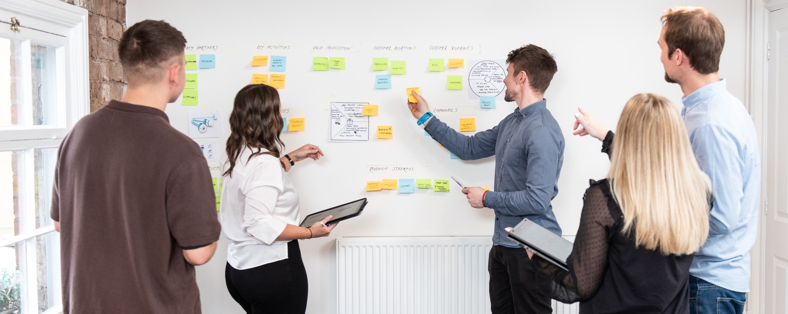
This is what we asked ourselves. We still whole heartedly believe that simple design does indeed work so that’s a big tick for our company name. It was a whole team effort to openly discuss what we thought we were and who we aspire to be. Now normally you’d expect a bit of a conflict but we were all absolutely on the same page.
- We’re human.
- We’re honest.
- We want to work collaboratively.
- We support everyone around us.
- We want to reduce the personal impact we make on the environment, as well as through the work we produce for our clients.
With design being such an innovative industry, we’re always learning and always improving which led us to the word ‘kaizen’. Kaizen is the Sino-Japanese word for ‘improvement’ and refers to a business concept where all functions and employees in a business continuously improve…which fits our ethos perfectly! So with a set of company values in hand we scrutinised our branding.
Simply new ideas
We’re extremely proud of our business and have ambitious future aspiration. So with new employees on board, we all had new ideas about how we could build our brand. We brought our ideas together and agreed that we wanted a clean visual identity that, like us, was approachable and would stand out in a crowd. So, we gave our logo a big pat on the back for its faithful service and help in getting us this far.
As you’d expect from a creative bunch, they all started tapping and sketching away to produce concepts which were presented back to the team for feedback. We debated the trends of applying clean and flat concepts, as well as use of primary and secondary colours.
What’s brand new?
Think of our new look as a personal makeover – a new haircut and a new outfit. It’s still us with the same values underneath but with a bit more style.
We’ve spent the early part of 2020 rolling out our refreshed brand. We hope you think it’s fresh, honest and slightly humble so that the work we do takes centre stage. To accompany it, we’ve invested in new visuals – graphics, photography and video – to show you that the people behind the scenes are real, resourceful, versatile and friendly. You’ll see that our communications have changed too. We now have a wider audience so we use plain-spoken language across all communication channels as we aim to inspire and educate you in the world of product design.
The use of colour was very important. Our logo is a beautiful bang-on-trend blue that could be seen as quite traditional. But it’s approachable and the addition of turquoise brings a splash of playfulness.
So that’s our brand redesign journey so far. This website is our biggest visual change and we’re excited at where we’ll see our logo next. As a team we’re embracing the future and to watch how our brand will guide us as we continue to grow.

