SkinSafe | User-centric medical device product branding
In context visuals of app branding on mobile phone for healthcare brand, SkinSafe
SkinSafe emblem as part of product brand guidelines

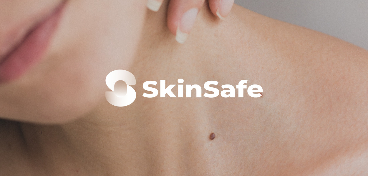
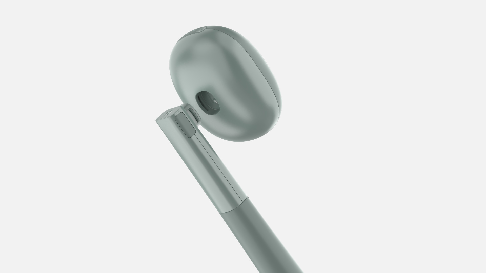
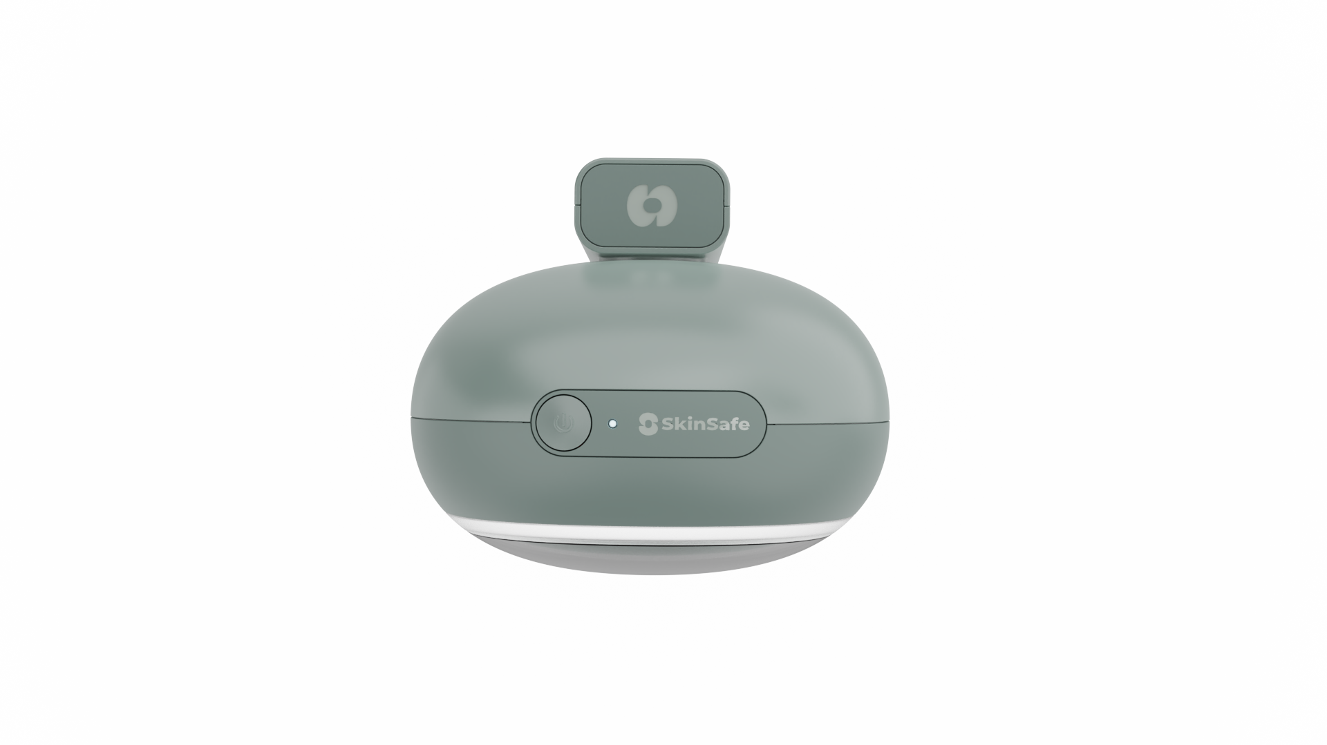
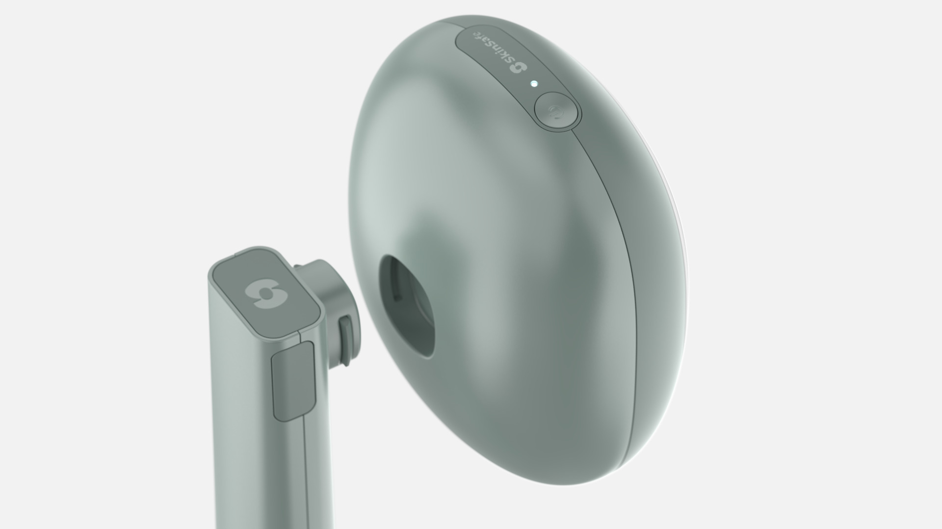
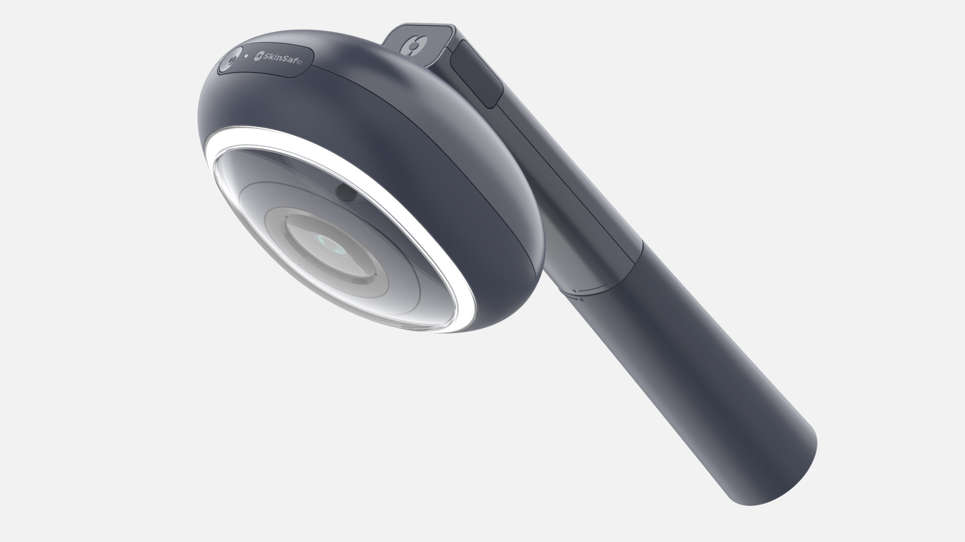
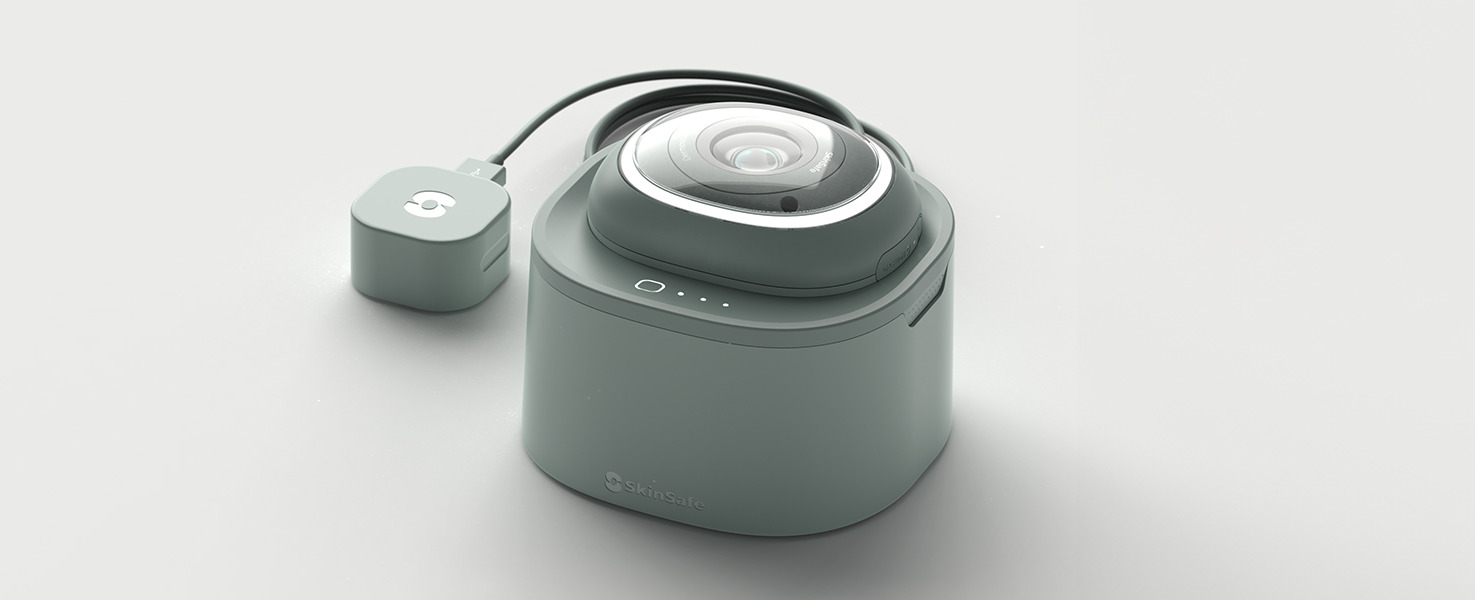
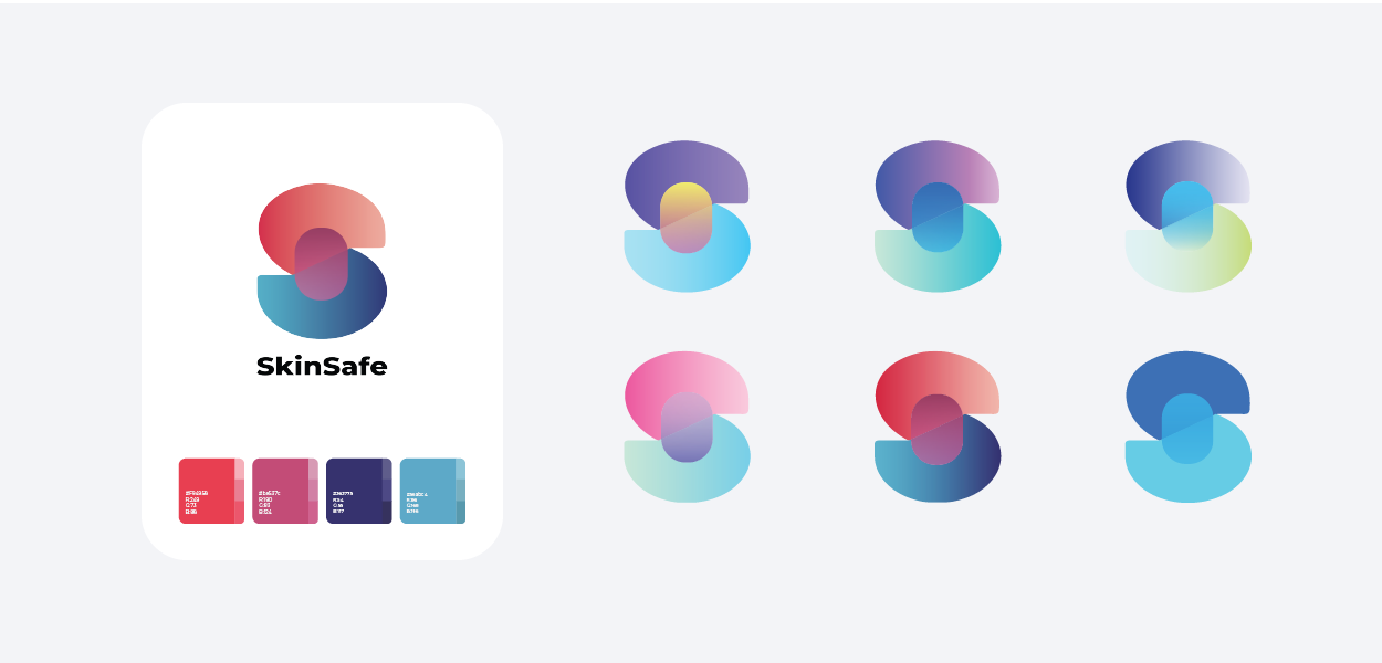
SkinSafe is a handheld non-intrusive scanning device that allows users to monitor their skin for the early warning signs of melanoma.

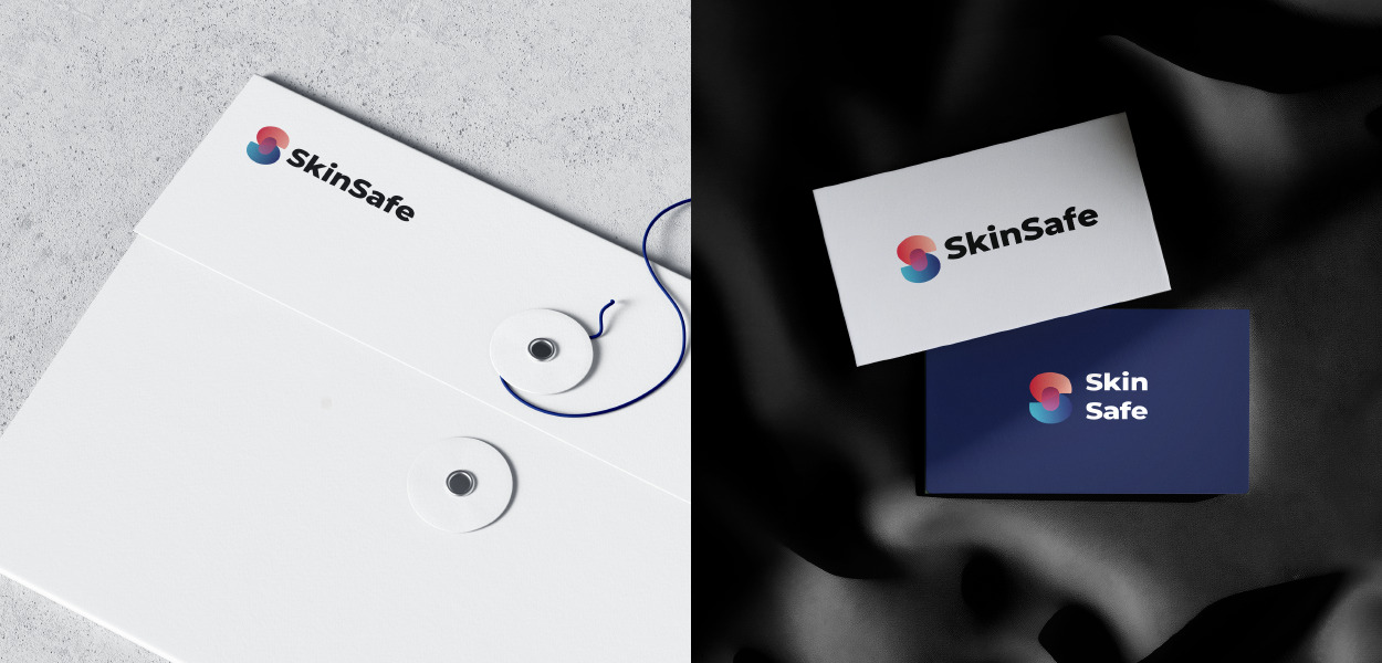
Its creators wanted to develop a device whose aesthetics, functionality and branding would incite potential purchasers to invest in their well-being.

The branding needed to appeal to three distinct user groups: people who have had melanoma, their families and the health conscious.

Naming a medical device

Our market research helped to identify core brand values the product and user experience.

Users wanted the device and its branding to feel friendly and modern. The name would be key to reinforcing these messages, making users feel safe and reassured not anxious and fearful. We all agreed that SkinSafe was the perfect fit.

We added a tagline ‘See beyond the surface’. This reinforces the message that the SkinSafe device enables you to pre-empt areas of concern.

Visual brand language

We were determined to create a logo whose core elements would align with the product’s form.

The pink central panel represents the head of the device. The sweeping curves of the graduated coral and blue ‘S’ reflect the ease with which users can scan their bodies. The effect is bold and sensuous rather than cold and clinical.

The font chosen is uncompromisingly clear. Like the device itself, it feels authoritative yet approachable.

3D CGI animation showing the proportions of the SkinSafe logo

Helping users picture the device in their home

Digital assets, including photo-realistic images, are perfect for using in collateral and packaging to show potential purchasers how the product will look in their home environment, within an app or in different colour ranges.

These photo-realistic images demonstrate the almost ornamental nature of SkinSafe. It’s a far cry from its more clinical competitors.

Reinforcing messaging through packaging

In line with the product’s aesthetics, we wanted to create an unboxing experience that’s on a par with technology packaging. High quality packaging and photo-realistic images build up anticipation and reinforce the credibility of the product hidden inside. CGI visualisations are an efficient method of bringing this to life before commissioning packaging manufacturers.

“SkinSafe needs two types of ‘shelf appeal’. The device must stand out on retailer shelves and websites yet blend in within the home environment. Both our industrial design and branding teams worked together to achieve this almost impossible mission…and we couldn’t be more delighted with the results.”

You might also like…

Previous
Seton | Design engineering EasyExtend
Next
The AA | Keeping Britain moving
Menu